
Empowered Chick’n Pop-Up
An unlikely combination of a pop-up chicken shop crossed with a women’s empowerment event.
The event has a tongue ‘n cheek approach, mocking the animalistic names ‘bird’ and ‘chick’ used in reference to women.
Throughout my research, I discovered that animalistic names such as these can have a damaging impact on the perception of women, which can cause a negative bias/impact on hiring and promotional decisions. The event aims to educate and raise awareness of the potential long-term effects that casual sexism can have on women.
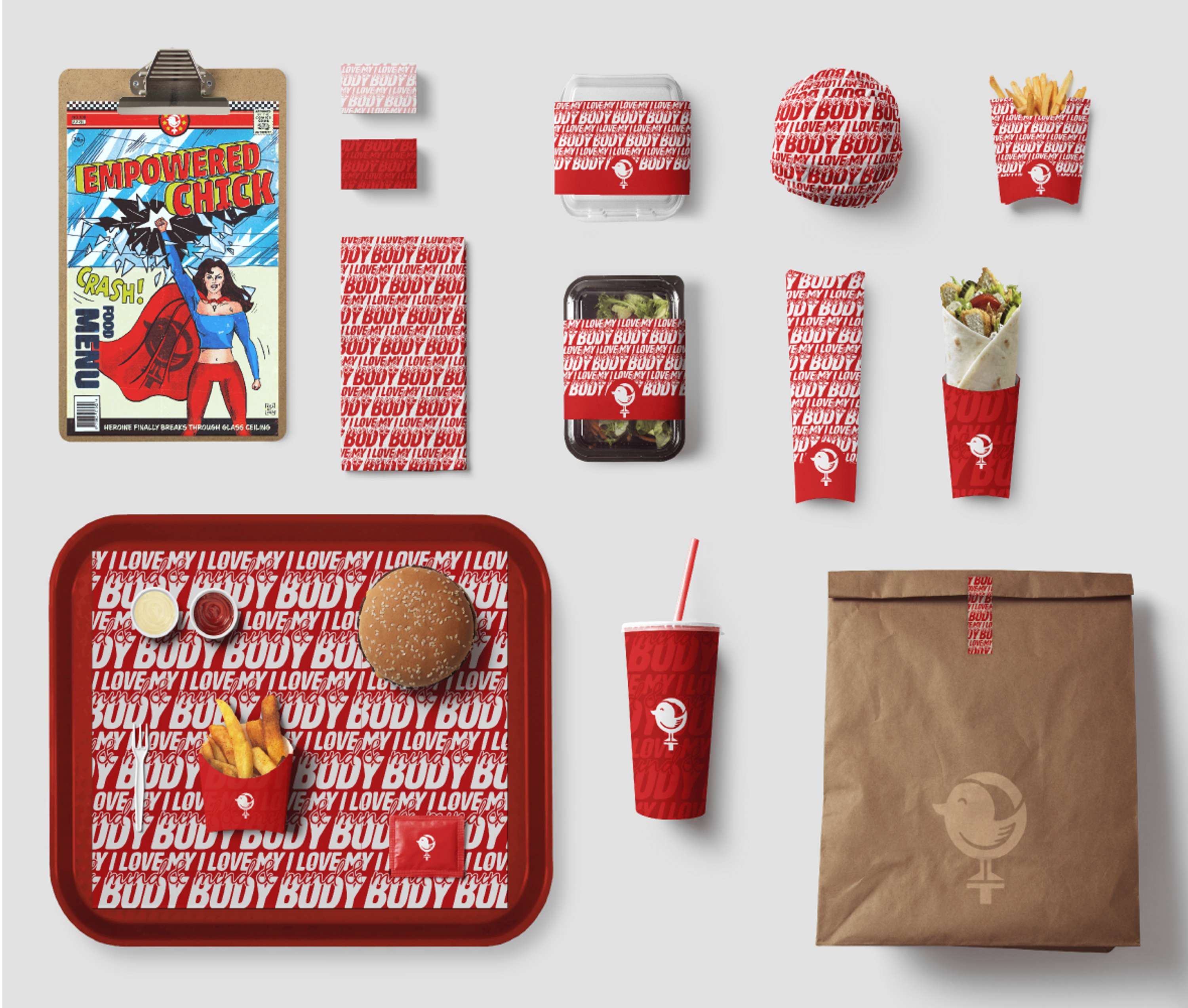
Event food packaging
The concept
The branding features positive affirmations, such as ‘I love my mind and body’, which when repeated regularly, help to build self esteem and confidence.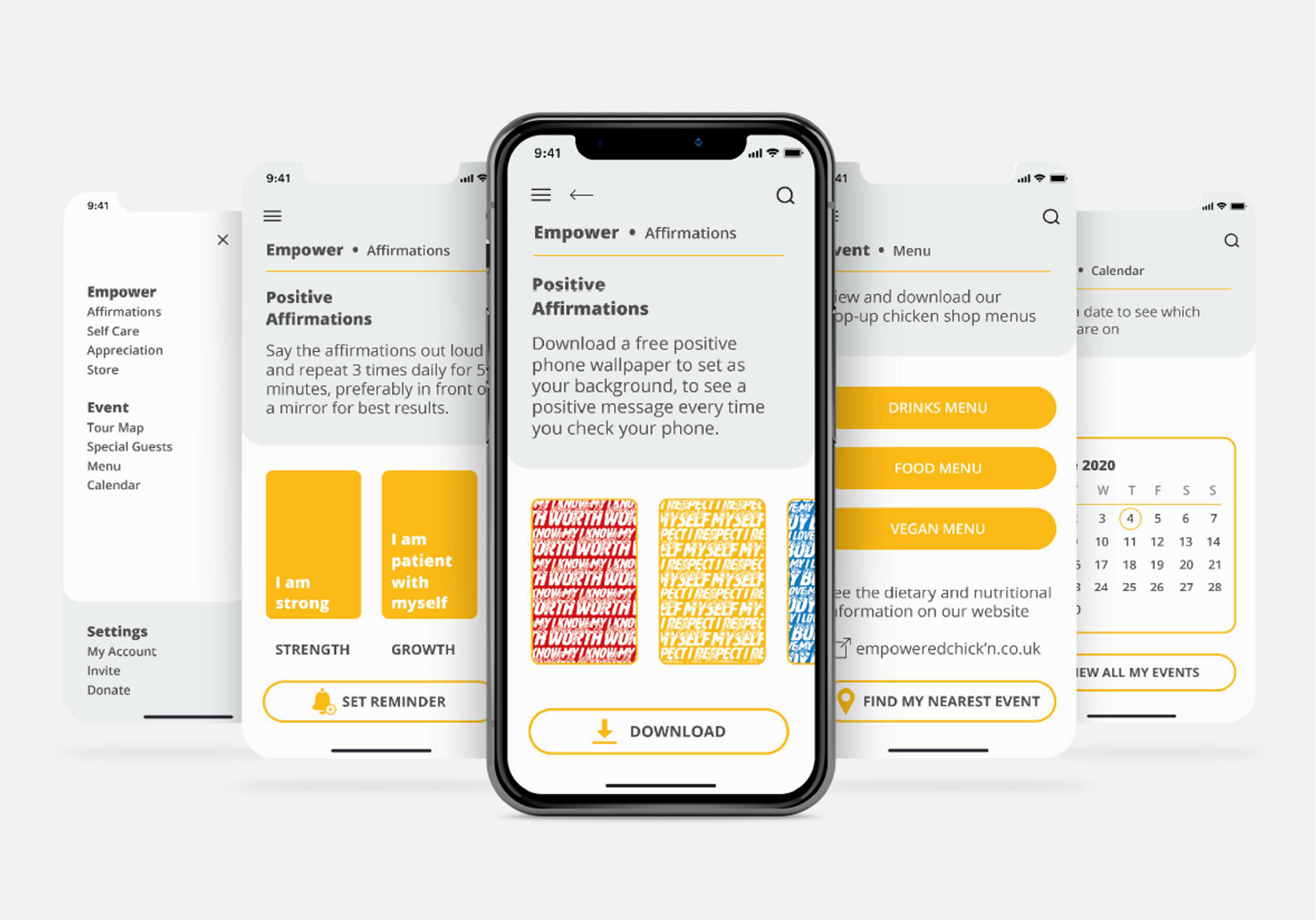
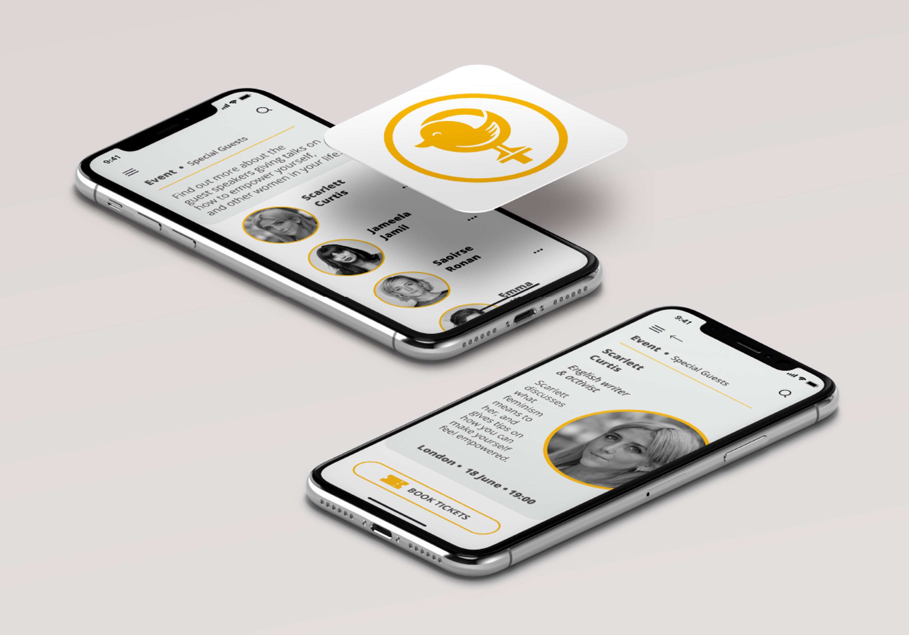
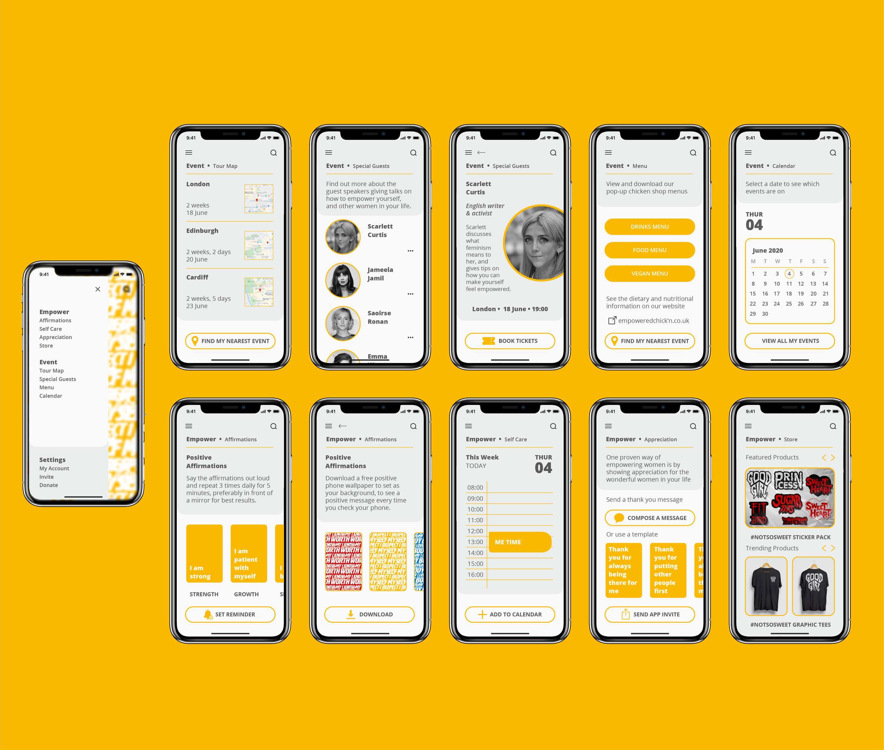
Event app
The concept
EventThis menu contains the tour map, information about the special guests, and an option to purchase tickets, the menu for the pop-up restaurant and the calendar, to view the time and location of the events.
Empower
This menu contains a positive affirmations section, which encourages users to say the affirmations to build confidence, by suggesting phrases and enabling them to set reminders each day. There is also a self care element, which will add a weekly hour of ‘me time’ to the user’s calendar, which they are unable to delete, to ensure they can schedule time for themselves in their busy week. There is also an ‘appreciation’ section, which encourages users to send a message of thanks, to women in their lives to empower people around them, as well as themselves. Lastly, there is a store page, where the proceeds go to charity Equality Now.
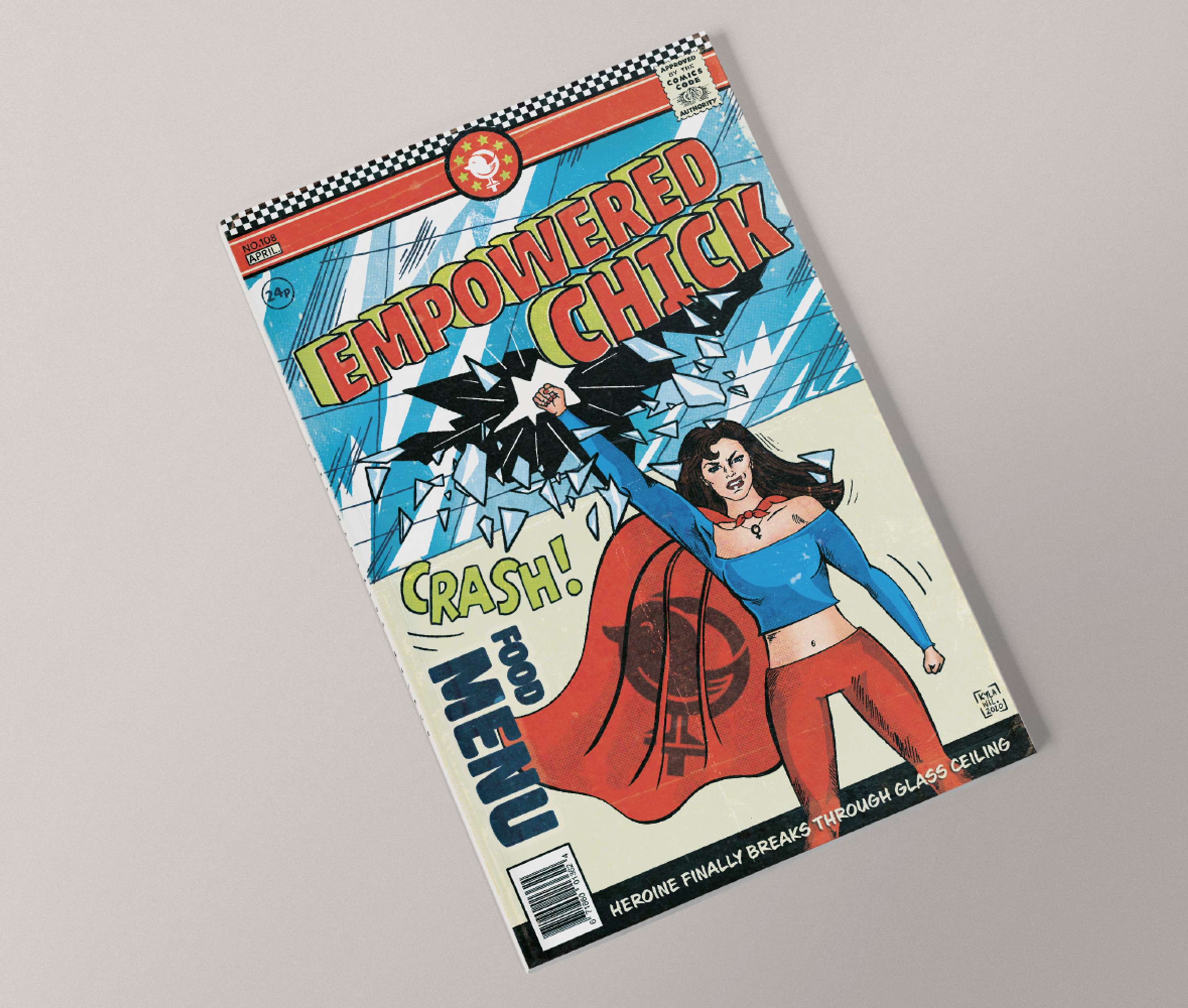
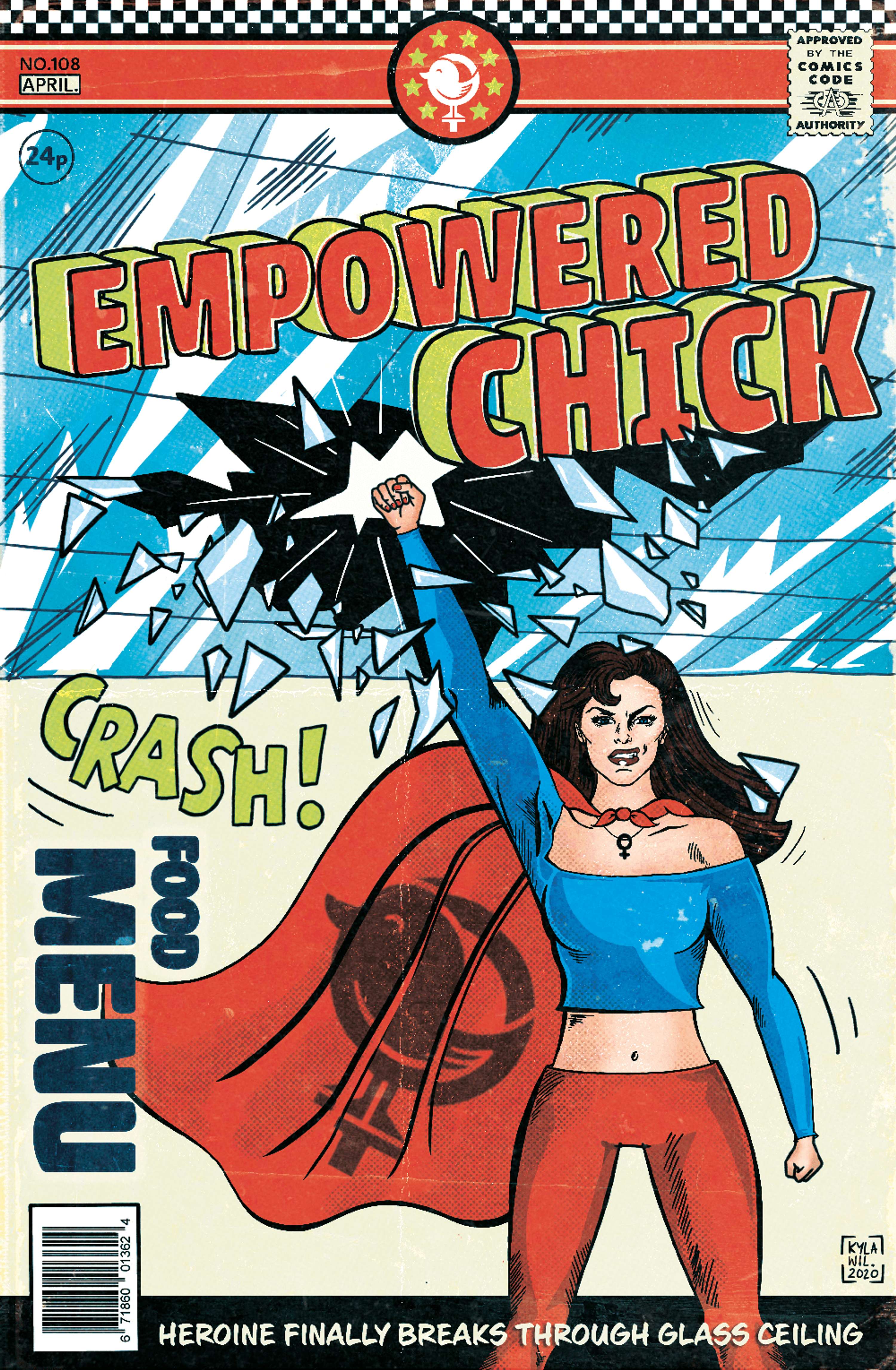
Vintage comic book style menu design
The concept
The menu design is based on the ‘glass ceiling’ metaphor, and features a comic book illustration, with a heroine breaking through the glass ceiling. The female superhero character is a symbol of strength.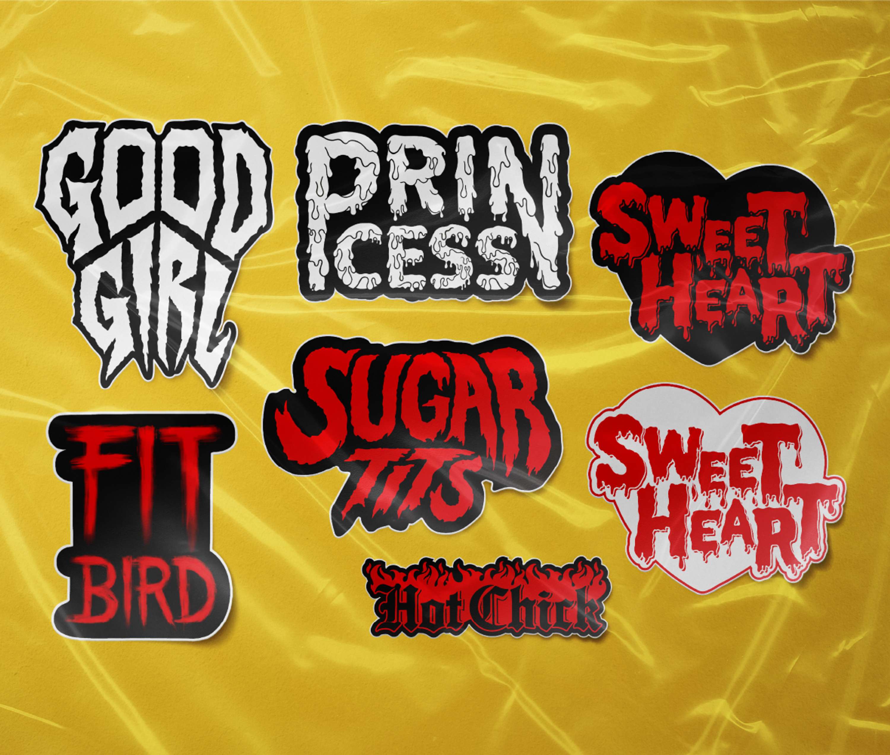
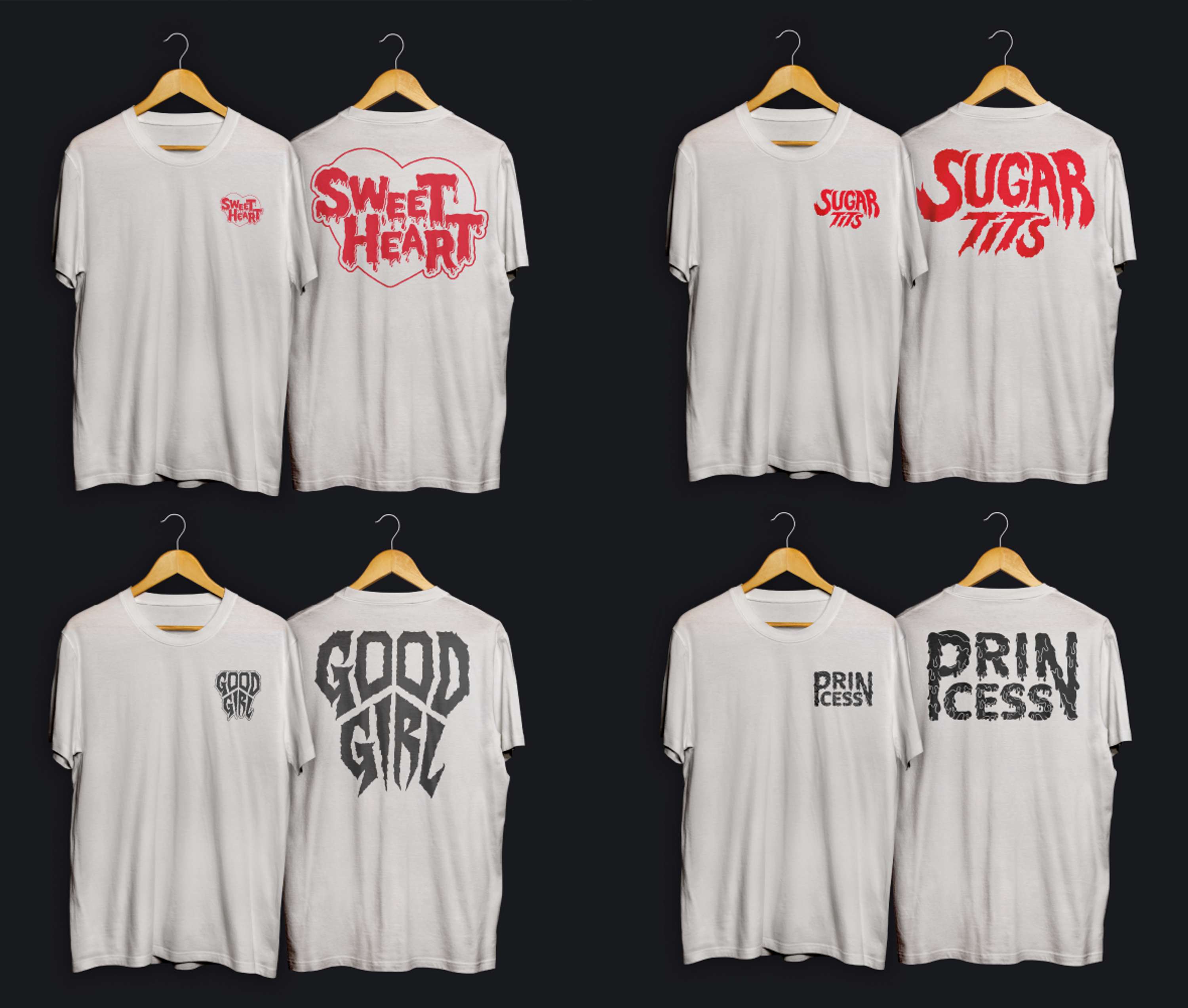
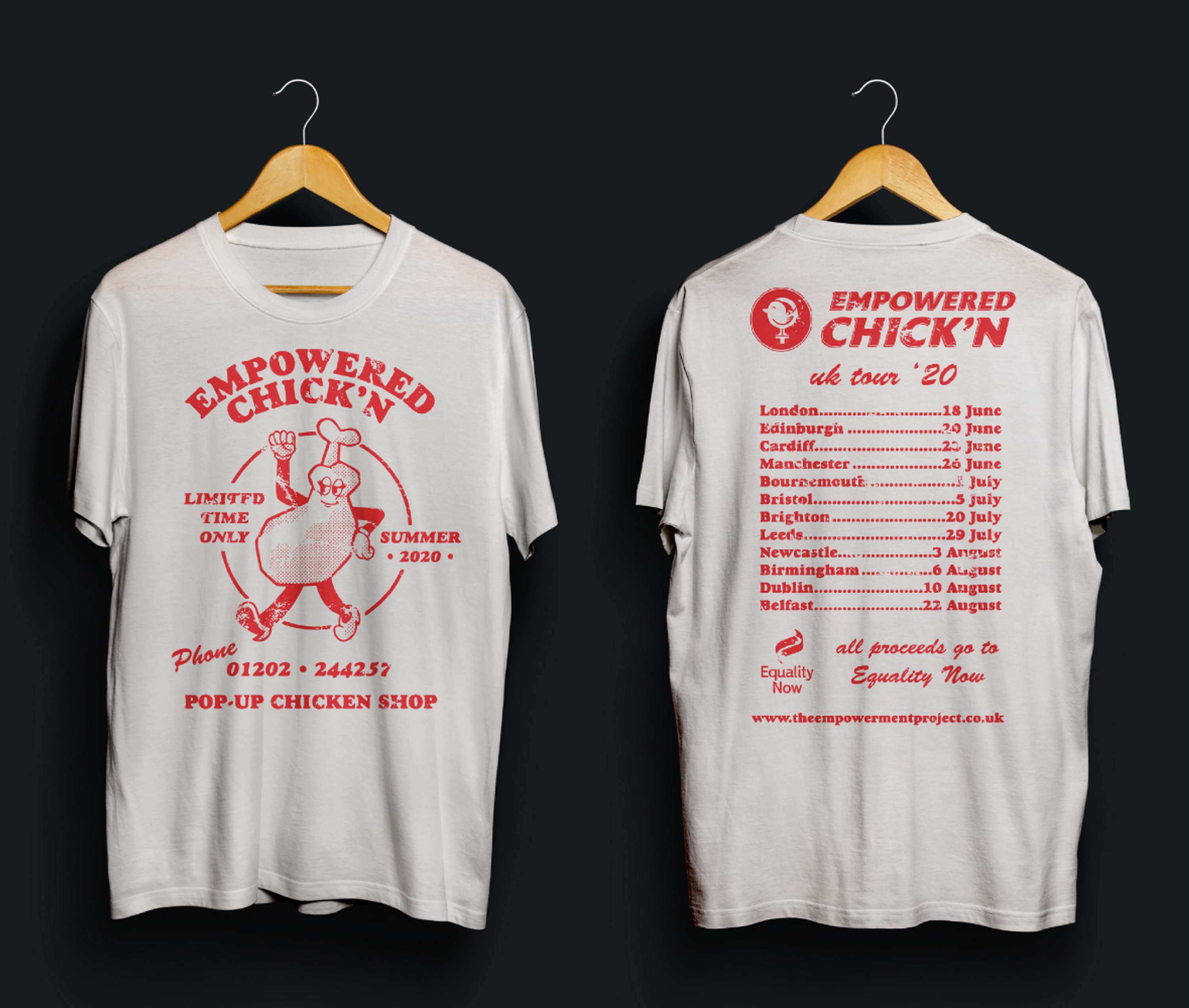
#NotSoSweet campaign merch
The concept
The stickers are a twist on the concept of self-labelling, giving women the ability to physically wear a label to make them feel empowered, and devalue/reduce the negative effect of the words. Even though the words seem harmless, casual sexism can have a negative effect on women long term.The typography conveys the names in an unconventional way, in a ‘gory’ or typically ‘masculine’ style in order to contrast with typical ‘cute’ and ‘girlie’ graphics. (The names featured in the stickers are some of the most disliked by women, which I discovered through research.)
The graphic tees would be sold at the event with the sticker pack, with the proceeds going to Equality Now.